
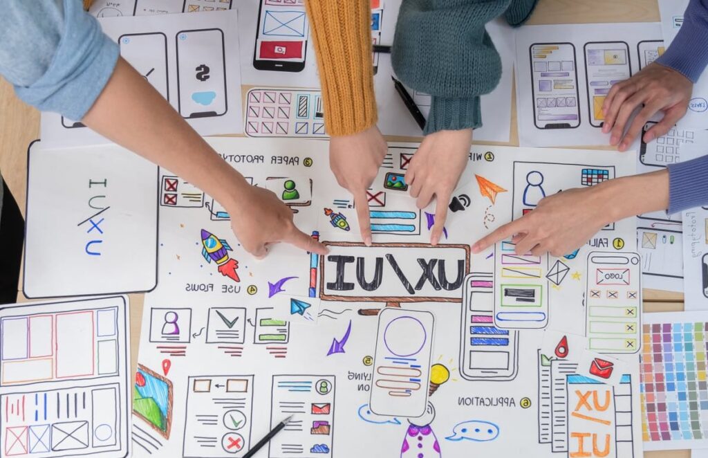
Every logo project that goes off the rails has the same root cause: a thin brief. Not a bad designer, not a picky client, just a logo design brief that skipped the questions nobody wanted to answer at the start.
This guide is written from the designer’s chair. It walks through every section a brief should contain, explains why each question exists, and shows exactly which revision rounds it prevents. Answer these 12 questions properly and you will typically cut a four week project down to two, with far fewer rounds of “can we see it in a different blue?”.
What Is a Logo Design Brief?
A logo design brief is a short written document that gives a designer everything they need to create the right mark on the first attempt: your business goals, your audience, your brand personality, your visual constraints, and the exact files you need at the end.
It is not a wish list and it is not a design instruction manual. A good brief describes the problem to solve, not the solution to draw. The moment a brief says “make the icon a blue circle with a swoosh”, it has stopped being a brief and started being a bad design.
Brief vs Creative Brief vs Brand Brief
| Document | Scope | Typical length |
|---|---|---|
| Logo design brief | One deliverable: the logo, its variations and its files | 1 to 3 pages |
| Brand brief | Full identity: logo, palette, type system, tone of voice, guidelines | 4 to 10 pages |
| Creative brief | A campaign or single piece of communication | 1 to 2 pages |
If you are commissioning a logo only, keep the brief tight. Three focused pages beat twenty pages of mood board with no decisions in them.

The 12 Questions Your Logo Design Brief Must Answer
Work through these in order. Each one is followed by a short note on the revision round it saves.
1. What does your business actually do, in one sentence?
Write it as if you were explaining it to a stranger in a lift. No jargon, no mission statement language, no “synergistic solutions”.
- Bad: “We are a disruptive platform empowering stakeholders.”
- Good: “We rent refrigerated vans to independent food producers in Belgium.”
Saves: the entire first round. Designers who do not understand the business default to generic shapes, and generic shapes always get rejected.
2. What is the exact name, spelling and tagline to be used?
Provide the name exactly as it must appear: capitalisation, accents, spacing, punctuation, legal suffix (SARL, Ltd, GmbH, Inc). Then state whether the tagline is part of the logo lockup or lives separately.
- Full legal name
- Trading name (if different)
- Tagline, and whether it must be locked to the mark
- Any abbreviation or monogram that also needs a version
Saves: the humiliating round where 30 concepts are redrawn because the company name has a hyphen nobody mentioned.
3. What are your business goals for the next 12 to 24 months?
A logo is a business asset with a shelf life. Tell the designer where the business is heading between now and 2028: new markets, new product lines, franchising, an app launch, moving upmarket, selling the company.
A brand about to expand into three languages needs a mark that reads without English wordplay. A brand about to franchise needs something that survives being reproduced badly on a shop awning.
Saves: a full redesign in eighteen months.
4. Who is the target audience, specifically?
“Everyone” is not an audience. Give the designer at least these four data points:
- Age range and life stage
- Where they are geographically
- What they currently buy instead of you
- What they are afraid of or frustrated by
A logo aimed at hospital procurement officers and a logo aimed at 24 year old skateboarders are solving different problems, even when the product is identical.
Saves: the round where the client says “it feels too young” without being able to explain why.
5. How should the brand feel? Give three to five adjectives.
Pick a short list and commit to it. Then, and this is the part most clients skip, name the opposite for each one.
| We want to feel | We must not feel |
|---|---|
| Trustworthy | Corporate, cold, bank-like |
| Crafted | Rustic, hand-drawn, folksy |
| Modern | Trendy, disposable, startup-cliche |
Saves: two rounds minimum. The negative column is the single most useful thing in most briefs.
6. Who are your competitors, and what do you think of their logos?
List three to six direct competitors with links. For each one, write a one line verdict: what works, what does not, and whether you want to sit near them or as far away as possible. Good Brief: Get Unique Design Briefs tackles the same question from another angle.
This does two jobs. It stops the designer accidentally producing something that looks like your closest rival, and it reveals the visual conventions of your category so you can decide consciously whether to follow or break them.
Saves: the awkward moment three weeks in when someone notices the concept resembles a competitor.
7. What do you like, and what do you hate? Show examples.
Collect 5 to 10 logos you admire, from any industry. For each one, add a sentence explaining what specifically you like: the letterforms, the simplicity, the colour, the way it works as an app icon. “I just like it” is useless.
Then do the same for logos you dislike. The dislike list is often more informative than the like list.
Saves: the guessing game. Also protects you from a designer’s personal taste overriding your brand.
8. Are there any colour requirements or restrictions?
Be explicit about all three categories:
- Must use: existing brand colours, parent company palette, franchise rules
- Must avoid: colours owned by a competitor, colours with bad cultural meaning in your markets, colours the founder simply refuses
- Practical limits: single colour printing, embroidery thread limits, engraving, vehicle wraps, packaging substrates
Also confirm that the logo must work in pure black and pure white. It always must, but say it anyway. Much the same conclusion turns up on adobe.com.
Saves: the round where a beautiful gradient mark cannot be embroidered on a polo shirt.
9. Is there any existing brand material to respect or retire?
Tell the designer whether this is a ground up creation or an evolution. If it is an evolution, state which equity you must keep: a shape, a colour, a mascot, a specific typeface, or simply recognisability from a distance.
Send whatever exists in its highest quality form, plus any brand guidelines, even outdated ones.
Saves: a full concept round built on the wrong assumption about how radical the change should be.
10. Where will the logo be used?
List every real world application you can think of. This directly determines how the mark is constructed.
- Website header and favicon
- Social media avatars (circular crop)
- Mobile app icon
- Business cards, invoices, email signatures
- Signage, vehicle livery, uniforms
- Packaging, labels, stamps, stickers
- Merchandise, embroidery, laser engraving
- Sponsorship boards, exhibition stands
Note the smallest size it will ever appear at. A mark that must survive a 16 by 16 pixel favicon and a 20mm bottle cap needs radically fewer details than one destined for a billboard.
Saves: the late request for a “simplified version”, which is really a second logo project.
11. Exactly which files and variations do you need?
This is the section clients skip most often and regret most painfully. Spell out the deliverables in the brief so they are inside the quoted price.
| Deliverable | Format | Used for |
|---|---|---|
| Master vector artwork | AI, EPS, SVG | Any size, printers, future edits |
| Web images | PNG (transparent), SVG, WEBP | Website, email, slides |
| Print ready | PDF (CMYK and Pantone) | Commercial printing |
| Favicon and app icon | ICO, PNG at multiple sizes | Browsers, mobile |
| Social pack | Square and circular PNG | Profile pictures |
And confirm the variations:
- Primary horizontal lockup
- Stacked or vertical lockup
- Icon or symbol on its own
- Monochrome black and monochrome white (reversed)
- Optional: monogram, favicon-specific simplification
Finally, state whether you want a one page usage sheet covering clear space, minimum size and misuse examples. It costs little and prevents years of internal misuse.
Saves: paying twice, and the panic email to your designer the day before a print deadline.
12. What is the budget, timeline, and who approves the final logo?
Three answers, all non negotiable in a serious brief:
- Budget range. A range is enough. It tells the designer how many concepts and how much research the project can carry.
- Deadline and the reason for it. “Before our stand at the trade fair in March” is more useful than “ASAP”.
- Decision makers. Name them. Two people maximum should give consolidated feedback, and the final signature should belong to one person.
Also agree the number of included revision rounds up front, and state ownership terms: full copyright transfer on final payment is the standard for logo work.
Saves: the committee round, where five people with conflicting opinions turn a good mark into a compromise nobody likes.
Bonus Section: Legal and Trademark Notes
Add a short paragraph covering anything legally relevant:
- Do you intend to register the logo as a trademark, and in which territories?
- Are there existing trademarks in your class you already know about?
- Do you need the designer to run a preliminary similarity check, or will your lawyer handle it?
Designers are not trademark attorneys, but flagging the intention early influences how distinctive the mark needs to be. A logo built around a common symbol is much harder to register.
Which Sections Save the Most Revisions?
| Brief section | If missing, expect | Impact |
|---|---|---|
| Brand adjectives and their opposites | Concepts in the wrong tone entirely | High |
| Approval process | Contradictory feedback, endless loops | High |
| Applications and minimum size | A logo that breaks at small sizes | Medium |
| Colour restrictions | Palette rejected late in the process | Medium |
| File deliverables list | Extra invoices and missing formats | Medium |
| Competitor references | Accidental resemblance to a rival | Medium |
A Copy and Paste Logo Design Brief Template
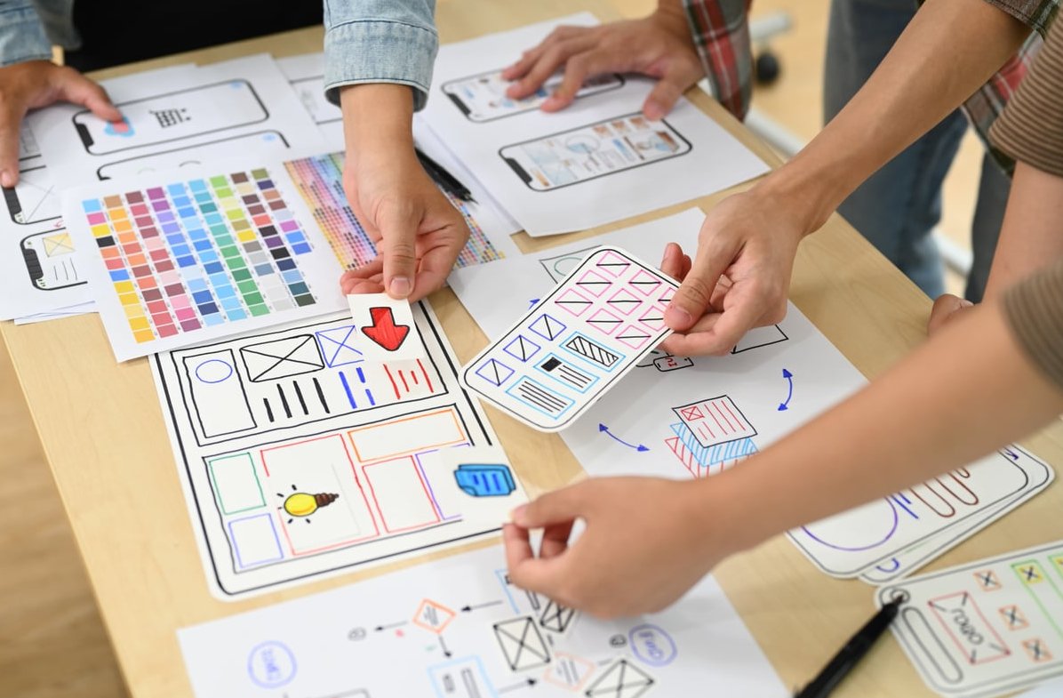
Paste this into a document, fill the blanks, and send it with your reference images attached. Keep it to three pages.
- Company: exact name, trading name, tagline
- What we do: one sentence, plain language
- Project type: new logo / redesign / evolution
- Business goals (next 12 to 24 months):
- Target audience: age, location, current alternatives, main frustration
- Brand personality: 3 to 5 adjectives + the opposite of each
- Competitors: 3 to 6 links with a one line verdict each
- Visual references we like: 5 to 10 examples + why
- Visual references we dislike: 3 to 5 examples + why
- Colour: must use / must avoid / production limits
- Typography and existing assets: what to keep, what to retire
- Applications: full list + smallest reproduction size
- Deliverables: variations, file formats, usage sheet yes or no
- Legal: trademark intentions and territories
- Budget range:
- Deadline and reason:
- Decision makers and revision rounds included:
Five Mistakes That Ruin an Otherwise Good Brief
- Designing in the brief. Describing the exact icon you imagine removes the reason you hired a professional.
- A mood board with no words. Images without explanation are ambiguous. Always annotate.
- Referencing only huge brands. Apple and Nike work because of decades of investment, not because a swoosh is inherently good.
- Hiding the budget. It does not get you a better price, it gets you a mismatched proposal.
- Adding decision makers halfway through. Every new opinion after the concept stage costs a round.
How Long Should the Process Take?
| Stage | Typical duration |
|---|---|
| Brief writing and kickoff call | 2 to 5 days |
| Research and concept development | 1 to 2 weeks |
| Concept presentation and feedback | 3 to 7 days |
| Refinement rounds | 1 to 2 weeks |
| Final files and usage sheet | 2 to 4 days |
A complete brief typically compresses the middle of that table. A vague one expands it indefinitely.
FAQ
What are the 5 parts of a design brief?
Most briefs, whatever the discipline, reduce to five parts: background (who you are and what you do), objectives (what the design must achieve), audience (who it speaks to), scope and constraints (deliverables, technical and brand limits), and logistics (budget, timeline, approvals). The 12 questions above are simply these five parts broken into answerable pieces.
What is an example of a design brief?
A short example: “Nord Cargo rents refrigerated vans to independent food producers across Belgium and the Netherlands. We want to double our fleet by 2028 and move into Germany. Our audience is owner-operators aged 30 to 55 who currently use general purpose rental firms and worry about breakdowns. The brand should feel reliable, practical and modern, never corporate or industrial. The logo must work in a single colour on vehicle vinyl and at favicon size. Deliverables: horizontal and stacked lockups, standalone icon, mono versions, AI, SVG, PNG, print PDF. Budget range and deadline included. Approval by the managing director only.” That paragraph tells a designer more than most twenty slide decks.
What is a branding brief?
A branding brief is broader than a logo design brief. It defines the brand’s positioning, goals, audience, personality, tone of voice and full visual direction before any design work starts, and it usually leads to a complete identity system: logo, colour palette, typography, imagery style, layout rules and written guidelines. Use a logo brief when you need one mark. Use a branding brief when you need an entire system.
What are the 5 qualities of a good logo?
A logo should be simple (readable at a glance), memorable (distinctive enough to recall), versatile (works in one colour, at any size, on any surface), appropriate (suited to the audience and sector), and timeless (built to outlive a trend cycle). Your brief should give the designer enough information to hit all five.
How long should a logo design brief be?
One to three pages of text, plus an attached folder of reference images. Longer briefs rarely add clarity. What matters is that every one of the 12 questions has a real answer rather than a placeholder.
Can I use a logo design brief template or generator?
Templates are useful as a structure, and brief generators are excellent for designers practising on fictional clients. For a real project, though, a template only works if you replace every generic line with specifics about your business, your audience and your production constraints. A filled-in template with vague answers is no better than no brief at all.
Final Word
A logo design brief is not paperwork. It is the cheapest insurance available on a branding project. Thirty focused minutes answering these 12 questions routinely removes two or three revision rounds, shortens approval by weeks, and produces a mark that still works when your business looks different in three years.
If you are preparing a logo project and want a second pair of eyes on your brief before you send it out, our team is happy to review it.